Intuit | QuickBooks for iPad
QuickBooks Re-imagined
In 2011 I worked with another user experience designer and user researcher on re-imagining QuickBooks for the iPad. The biggest challenge was taking a legacy 30 year old desktop product with hundreds of features and re-imagining the experience for mobile and touch.
On the Go
Focus in on lean-in task completion for on the go businesses.
Workflow Flexibility
Support various work styles from methodical to multi-tasking.
Just Do It
Optimize for "just do it for me" to remove friction from common tasks.
Awesome First Use
First use is critical to engage and delight our users.
Sketch & Wireframes
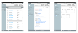
After extensive user research studies and brainstorming sessions, we iterated on quite a few directions initially until we were able to identify an optimal user experience. These wireframes are just a small subset of what was generated thru this process.
Moodboard Explorations
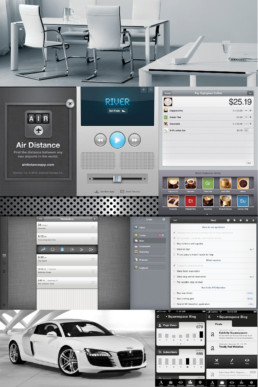
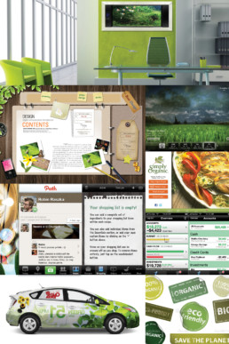
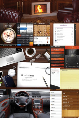
Once we understood what to build, we began the process of how to achieve our goals. For the visual design process, we began with creating some moodboards to evoke the right type of emotions for the experience.
Eco-Friendly
Smart, Efficient, Thoughtful, Green, Natural
Traditional
Professional, Rich, Precise, Aspirational, Relaxing
Business Casual
Welcoming, Friendly, Approachable, Colorful, Fun
UI Visual Language
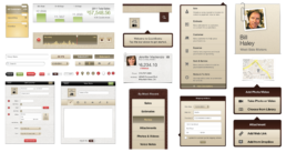
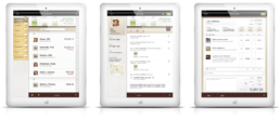
We settled on a direction where we wanted QuickBooks to be very tactile and object-oriented. Since accounting deals with real-world physical metaphors, we embraced skeuomorphism for its affordance and intuitive nature for people new to mobile touch experiences.
Visual Design
Design Evolution
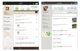
Skeuomorphism eventually went out of style and newer designs started adopting flatter designs, QB iPad changed colors, removed skeuomorphic elements but it still retained the original information architecture and interaction patterns to this day.
Original designs to latest designs
Original designs to latest designs
Intuit QuickBooks | iPad
The project lasted for about a year and the team consisted of 2 designers, 1 researcher, 1 PM, and 20 engineers.
ClientInuitServicesUX/UITeam2 Designers 1 ResearcherPlatformiOSYear2011ToolsPhotoshop, IllustratorLinksitunes.apple.com
